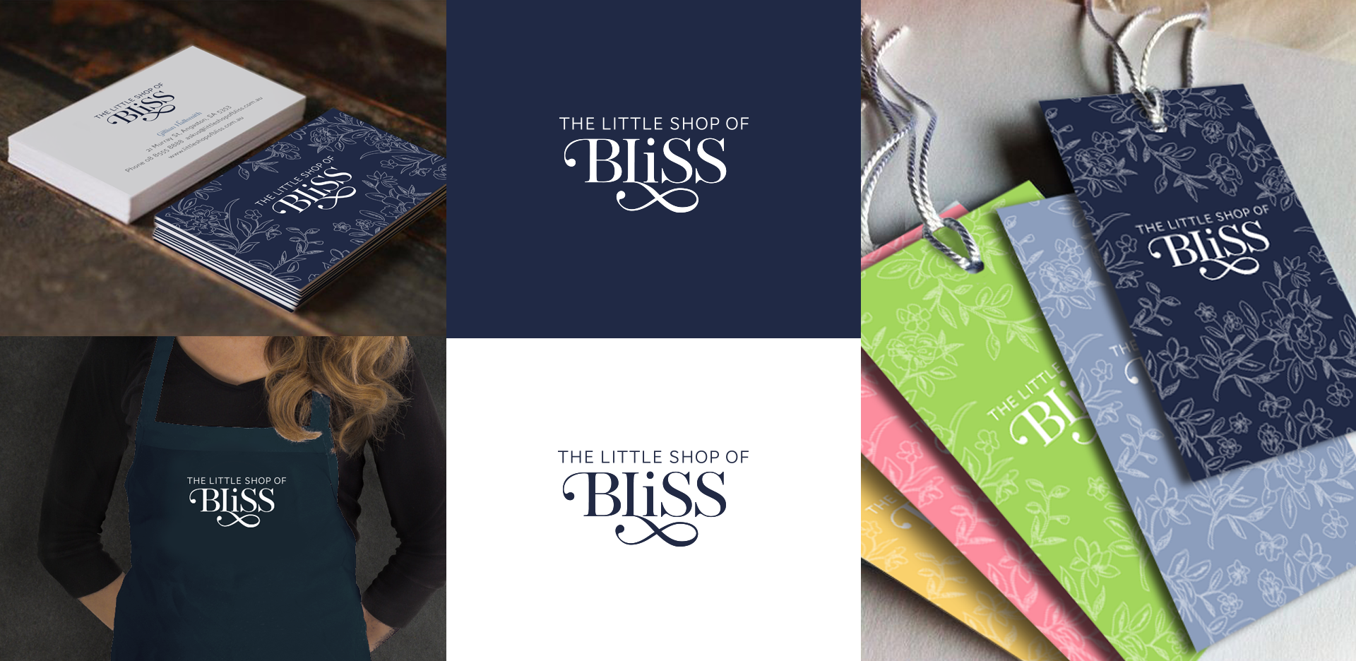
In 2015, I had the pleasure of working with The Little Shop of Bliss on their logo, inspired by the beautiful wallpaper that the business owner had found on a trip to France.
The logo needed to be simple so that it could be used in a single color in various formats. The simplicity of the text was designed to reflect the clean and simple lines of the ‘Scandinavian’-inspired origins of The Little Shop of Bliss. The beautiful ‘Bliss’ text conveys that the things you find in the shop are elegant, beautiful, and of high quality.
The lowercase ‘i’ helps the word to read better as ‘Bliss’ but also suggests that the products in the store are ‘out of the ordinary’ and delightfully surprising.
The hand-drawn flowers allude to the ‘handmade’ quality of the products in the store, which range from handmade soaps and beauty products to baked goods, fashion accessories, and homewares. When paired with the logo, they give an elegant and soft feel to the design. I used the flowers throughout the store and on the shop signs.
The color palette was drawn from the referenced wallpaper, with a secondary color palette that was used for the promotion of different kinds of products as accents to the primary design.