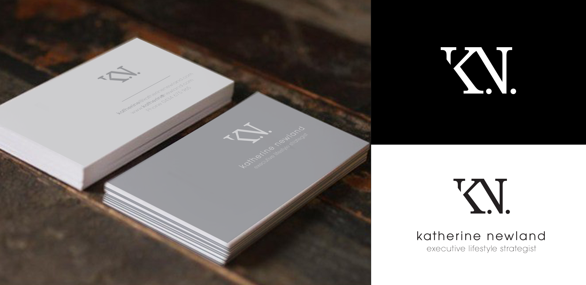
In 2015 I had the pleasure of working with Katherine Newland on her branding.
We wanted the logo to be simple and clean, conveying a sense of an established, trustworthy, and professional business and we used an old typeface to reinforce this idea. The icon has an appearance of being partially revealed, illustrating that having a lifestyle strategy helps make your future vision clearer. As you go through your strategy sessions, your desires and goals will be revealed. I used a modern typeface for the name Katherine Newland to convey freshness and youth, using lower case to make the logo more open and friendly.