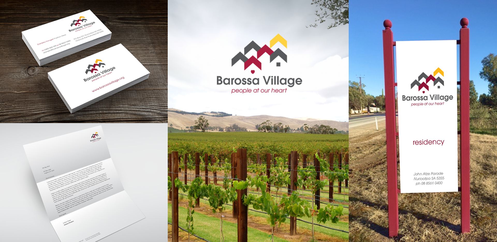
In 2016 I worked with Hongell & Me to created the visual identity for Barossa Village
I wanted to create a sophisticated and modern logo, to appeal to the Baby Boomer generation.
The village icon represents community. The rooves of the village represent upward arrows and movement, to give a sense of progress and innovation. The various levels of the houses allude to the differenct styles of accomodation available at Barossa Village.
The Yellow roof is a focus point and a high point suggesting upward mobility and future directions. When viewed from the customer perspetive the highlight suggests bright future directions and upward mobility. When viewed from the organisaztional perspective it suggests that Barossa Village stands out from the crowd.
I’ve chosen modern sans serif face to appeal to the Gen X audience (children of the Boomers). It is also a good font for the older generation, as sans serif is easy to read. The heart in the icon links to the tagline, ‘People at our heart’.