For those of you with a black-and-white logo, spring is the perfect time to refresh and reinvigorate your brand with a new colour theme. Of course, you need to be mindful that any changes still support your message and resonate with your audience.
This season, I’m excited to introduce a new colour palette inspired by the vibrant hues of spring, bringing warmth, renewal, and energy to my socials and website.
When creating, evolving, or updating your brand, it’s worth understanding the role colour plays and ensuring that you are thoughtful about the way you use it.
Colours have the ability to influence emotions and behaviour. When chosen thoughtfully, they can reinforce your brand’s message, create a memorable identity, and foster a deeper connection with your audience. Here are some points to consider as you use colour to enhance your brand:
Blue is often linked with calmness, trust, and stability. It’s known to have a calming effect on the mind and body, lowering pulse rates and reducing feelings of anxiety. Because of its association with trust and professionalism, blue is often used in corporate branding, especially in industries like finance, healthcare, and technology. It’s also seen as a reliable and dependable colour.
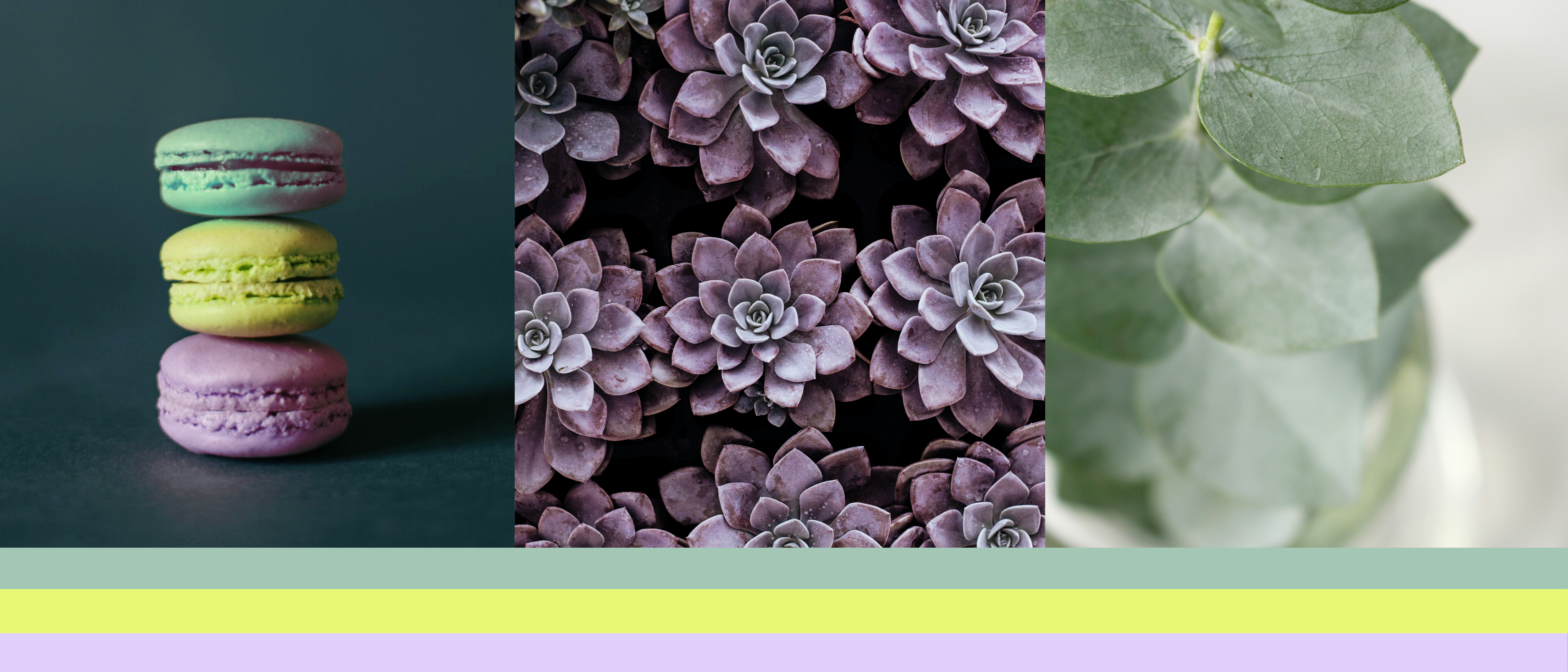
Yellow is the colour of sunshine, associated with happiness, optimism, and warmth. However, it can also trigger feelings of caution or anxiety if overused. Yellow is often used to grab attention and to create a cheerful and inviting atmosphere. It’s also common in children’s products and fast food branding due to its energetic and friendly vibe.
Green often symbolises growth, freshness, and health, making it ideal for brands that focus on wellness, nature, or sustainability.
Purple is often associated with luxury, creativity, and calm, adding a touch of sophistication and elegance.
Orange combines the energy of red and the cheerfulness of yellow and is associated with enthusiasm, creativity, and success, often invoking feelings of excitement and warmth. It is often seen in branding that targets youthful, energetic audiences, such as in sports or entertainment.
Grey is often viewed as neutral, balanced, and sophisticated. It can convey feelings of calmness and professionalism. Be careful however of the hue you choose to avoid your designs feeling dull or emotionless. Grey is popular in modern, minimalist designs due to its understated elegance and is often used in industries that value professionalism.
In a crowded market, colour can help your brand stand out. By choosing a unique palette, you can differentiate your brand from competitors and make a lasting impression.
Consistent use of colour across all your branding materials—from your website and printed material to your social media feed—can enhance brand recognition, making it easier for your audience to remember and identify your brand.
This spring, I’ve drawn inspiration from the latest interior design trends to create a colour theme that captures the essence of renewal and brightens up my feed.
I’m kicking off September with Pantone 923 C Honeysuckle, a bright and lively hue that evokes the fresh burst of spring buds. This colour reminds me of the first signs of life reemerging after winter, a perfect representation of the energy and growth that spring brings.
Pantone 559 C Summer Green is a warm yet subtle green that reflects the increasing warmth of October and evokes thoughts of ocean breezes and the soft glow of summer sunsets that I’m looking forward to when summer rolls around. It’s a colour that brings calm and freshness, making it perfect for brands looking to convey serenity and a connection to nature.
As we approach November, the soft purple of Pantone 263 C Moon Raker reminds me of the jacaranda trees that reach full bloom in Adelaide, which I look forward to every year. This colour inspires thoughts of elegance and tranquillity, perfect for brands looking to add a touch of sophistication and calm to their identity.
To anchor these vibrant spring colours, I’ve chosen Pantone 433 C. This deep, neutral shade offers depth and reliability, ensuring that my colour theme remains grounded, providing balance and cohesion to the overall aesthetic.
Spring is a time of renewal, and there’s no better way to refresh your brand than by introducing a vibrant, seasonal colour palette. I hope these colours inspire your creativity and get you thinking about how you can use colour to enhance your brand’s visual appeal and create a deeper connection with your audience.