How to use colour psychology to elevate your brand
In the world of branding, colour isn’t just a visual element—it’s a powerful communicator that speaks directly to your audience. By choosing the right colours you can enhance brand recognition and convey your values. So, how can small business owners harness the power of colour psychology to create a compelling brand identity?
The power of colour in branding
Colour psychology is the study of how colours affect human behaviour and emotions. In branding, it’s a tool you can use to convey your brand’s personality and values. As researchers Lauren Labrecque and George Milne explain, “like a carefully chosen brand name, colour carries intrinsic meaning that becomes central to the brand’s identity, contributes to brand recognition, and communicates the desired image.”
Common colour associations
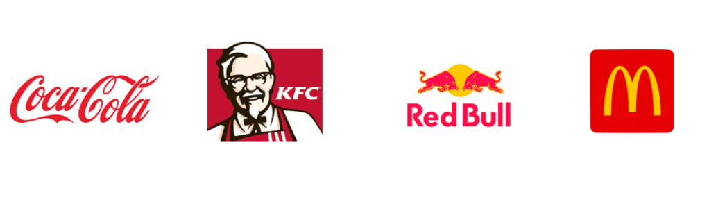
Red:Excitement, passion, urgency. It’s often used by brands that want to create a sense of energy and action.
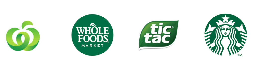
Green:Health, tranquility, growth. Ideal for brands linked to wellness, nature, or sustainability.
Black:Luxury, sophistication, power. Often used by high-end brands to communicate exclusivity.
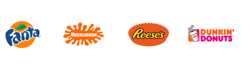
Orange:Enthusiasm, creativity, adventure. Orange is energetic and playful, suitable for brands wanting to appear fun and approachable.
Blue:Trust, dependability, professionalism. Popular in industries where reliability and calmness are important, like tech and finance.
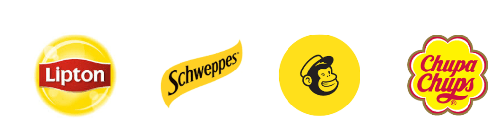
Yellow:Optimism, warmth, happiness. Yellow grabs attention and conveys friendliness.
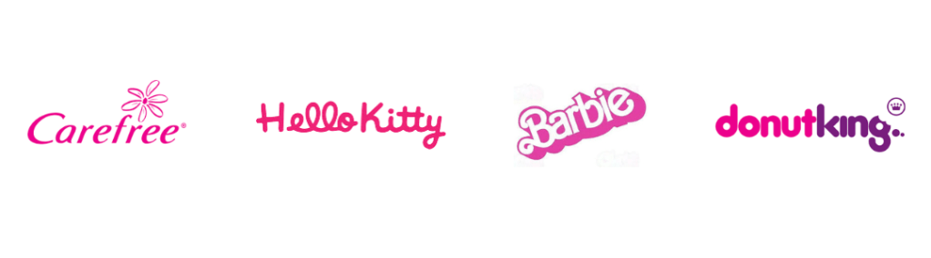
Pink:Feminine, playful, romantic. Frequently used by brands targeting a youthful or female audience.
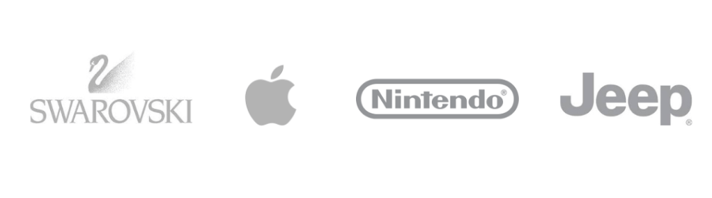
Gray:Neutrality, balance, sophistication. Gary is often used to convey professionalism or to complement brighter accent colours.
Many small business owners struggle with creating a consistent brand presence. Unfortunately, without a deliberate colour strategy, you could be sending mixed signals which could lead to confusion and a lack of trust among potential customers. But there is a solution, be intentional about selecting colours that align with your brand’s values and resonate with your audience to create a compelling brand identity. As designer Kelly Wittman notes, “when you select your colours with intention, they can support the desired perception that you’re trying to create for your brand.”
Benefits of applying colour psychology
Enhanced brand recognition: Consistent use of specific colours can increase brand recognition by up to 80%. DesignRush
Emotional connection: Colours evoke emotions, helping to establish a deeper connection with your audience.
Influence on purchasing decisions: Strategic colour choices can impact consumer behaviour, potentially increasing sales.
Key Takeaways
Understand colour meanings: Familiarise yourself with common colour associations to ensure your choices align with your brand message.
Consider your audience: Select colours that resonate with your target demographic and cultural context.
Maintain consistency: Use your chosen colour palette consistently across all brand materials to strengthen recognition.
Test and refine: Gather feedback and be willing to adjust your colour strategy to better connect with your audience.
Ready to elevate your brand?
At Splitpants Productions, we believe in the power of thoughtful design to elevate your business’ presence in the market. If you’re ready to create a brand identity that truly resonates, consider exploring our branding packages. Together, we can craft a visual identity that authentically represents your business and appeals to your audience.
Remember, the colours you choose are more than just aesthetic decisions—they’re a vital part of your brand’s story. Let’s make sure it’s a story worth remembering.