Provision of print ready artwork for signs and coffee loyalty cards
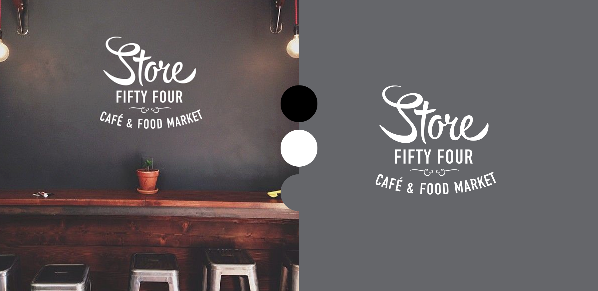
Store 54 Branding – A Blend of Warmth and Modernity
In 2015, I had the pleasure of creating the branding for Store 54, a cafe ‘general store’ for everyday necessities located in Melrose, South Australia. The branding needed to reflect both the welcoming, homey atmosphere of the store whilst also having a quality modern aesthetic.
The logo I designed embraced simplicity, using a monochromatic palette of black, grey and white. This choice allowed the warmth of the café’s décor, particularly the wooden accents, to shine through without overwhelming the design. The goal was to create a clean, tidy brand that felt both modern and nostalgic.
I designed the logo to evoke a sense of ‘old world’ charm, reminiscent of traditional general stores, while still being sleek and contemporary. By balancing these elements, the Store 54 brand became a perfect reflection of the space itself—a place where community, comfort, and everyday essentials come together in a modern yet familiar setting.