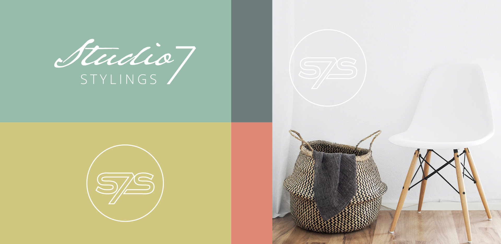
Visual Identity: Studio 7 Stylings
Customer: Studio 7 Stylings
Project: Brand Asset Package
Year: 2021
Services Delivered:
- Brand asset package
- Logo package
- Style guide
- Delivery of print ready PDFs
It was a pleasure to work with Studio 7 Stylings on their recent rebrand.
The brand we created is simple and stylish, featuring a free flowing hand script which suggests that styling is a craft that takes creativity and talent. The ‘7’ creates an upward pointing arrow which gives the logo a sense of movement, and alludes to the growth customers achieve as they increase their property value through the beautiful styling and staging provided by Studio 7 Stylings. The modern icon is a supporting element of the brand and is a simple redaction of the logo.
The master logo is black and white so that it can appear with any of the pallet colours, allowing for the updating of the brand as trends or seasons change. The fresh colour pallet of coral, pear, yellow and stone is seasonally compatible to support promotional options. It includes warm and cool colours which allow the brand to be complimented by a variety of styled home images.
