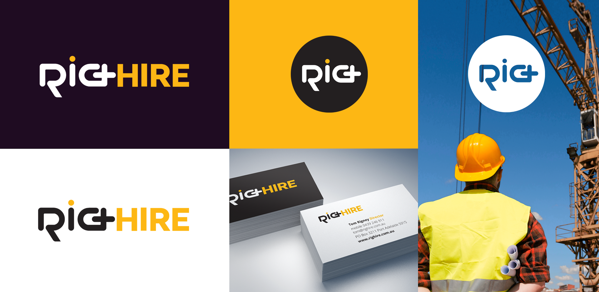
Once again it was a pleasure to collaborate with Renee from Roar Marketing on this new brand for Righire.
Based in South Australia, Righire are an employment contractor who support the crane industry by providing rigging staff, who ensure the safety of crane operations.
The ‘RIG’ in the Righire logo has been designed to stylistically represent a chain. Chains are an every day part of life for a Rigger and the icon shows that Righire link Crane Operators with Riggers. The link across the ‘G’ creates a ‘+’ to show that Righire adds staff to their customer’s and completes the chain/flow of their workforce.
The ‘I’ of rig has a dot to identify the ‘i’ but also symbolises a person, as Righire is hiring out personnel.
The recognisable hard hat yellow worn by riggers and construction industry has been chosen to recognise that riggers ensure the safety of each operation.