Visual Identity: MSA Maintenance & Construction
Customer: MSA Maintenance & Construction
Project: Brand Refresh
Year: 2023
Services Delivered:
- Logo concepts
- Brand Asset Package
- Style guide
- Provision of print ready PDF’s for printing
When MSA Maintenance & Construction approached me for a brand refresh, it was clear they needed a design evolution that truly reflected their strength and reliability.
The Challenge
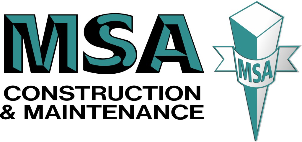
The original logo was a little outdated, with muted colours that didn’t capture the robust nature of a leading construction business. Although the company had tried to modernise their identity, the resulting logo was still muted and lacked the impact required by government and commercial audiences. To make matters worse, both the old and new designs were in use, which confused their audience and diluted the brand message. The design simply didn’t convey the strength and dependability expected from a business trusted by government agencies.
The Process
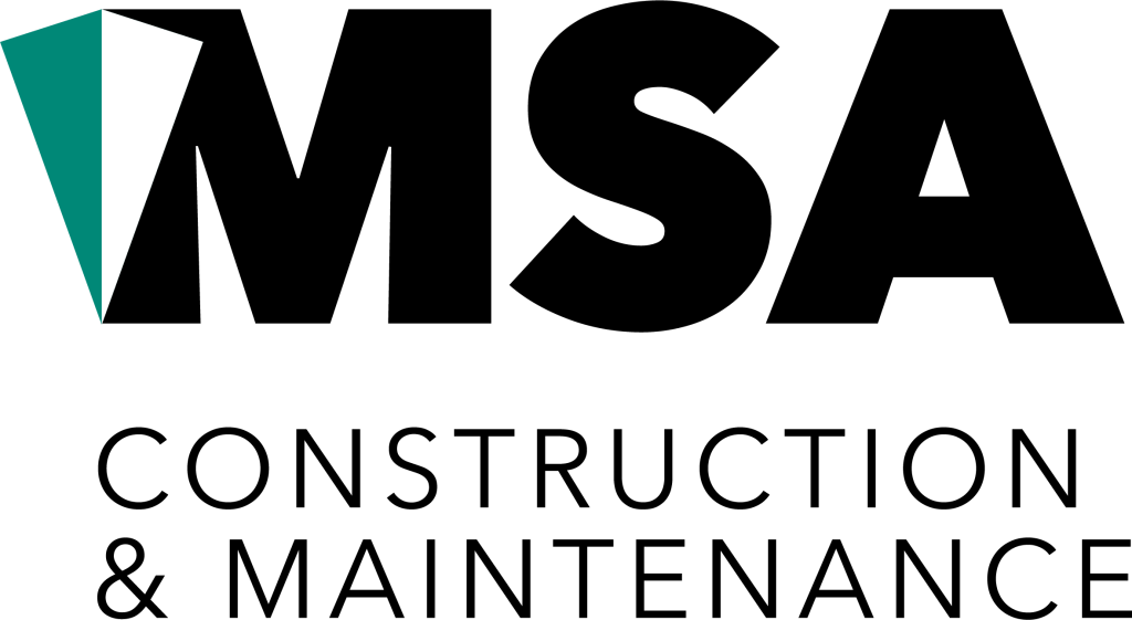
I began by identifying what truly mattered: retaining the iconic survey peg from the original design, but integrating it into a fresh, unified logo. The survey peg now forms a central element of the design, symbolising both the company’s heritage and its forward-thinking approach. I chose a bold, font that speaks to the strength and reliability essential for a construction business.
To replace the weak, outdated aqua, I introduced a stronger green—a colour that not only stands out but also conveys growth, stability, and confidence. This new colour palette, combined with a refined design, creates a modern look that aligns with the company’s reputation and appeals directly to government and commercial sectors.
The Result
The updated logo provides a cohesive, strong visual identity that eliminates confusion and solidifies MSA Maintenance & Construction’s brand as one that is modern, reliable, and built to last.
Ready for Your Brand Refresh?
Need help updating or evolving your brand? Sign up to our mailing list below and receive our FREE Brand Refresh Checklist to assess the strength of your brand.
Get in touch today to start building a stronger, more unified brand. Book a FREE 30 minute consult today
Before


After

