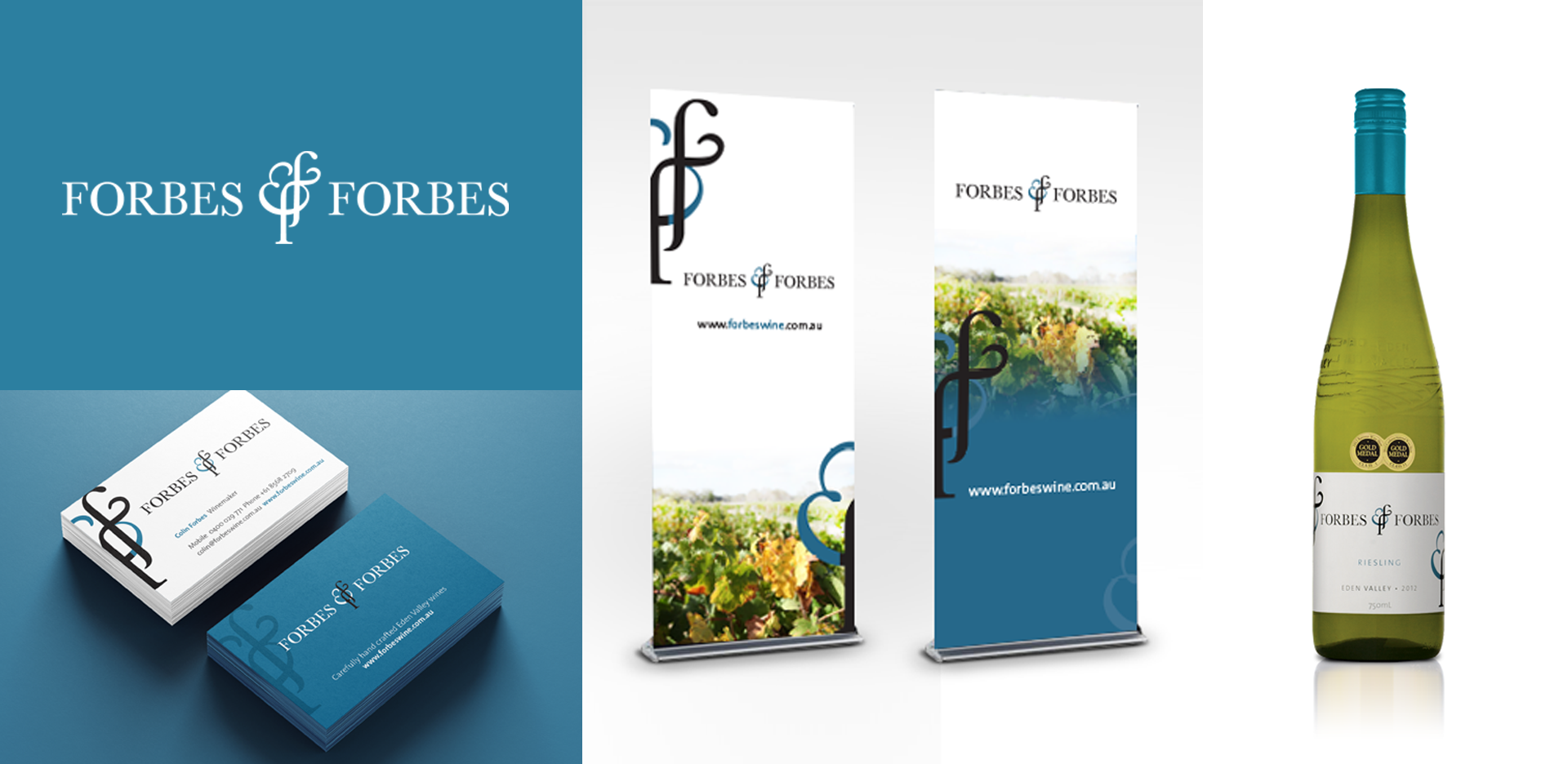
In 2012 I had the pleasure of working with Colin Forbes on the branding of Forbes & Forbes.
This simple design was created using the double ‘f’ representing the two forbes brothers of the business. The intertwining ‘f’s also blend in with the amphisand to create an icon that can be used across all their material.
The font used is an old typeface to represent the fact that Colin Forbes is well established in the wine industry with a host of awards for his wines.
The colours of the brand, though unconventional, are drawn from the tartan associated with the Forbes family.