In 2018, I had the pleasure of working with Black Dash to create their new branding.
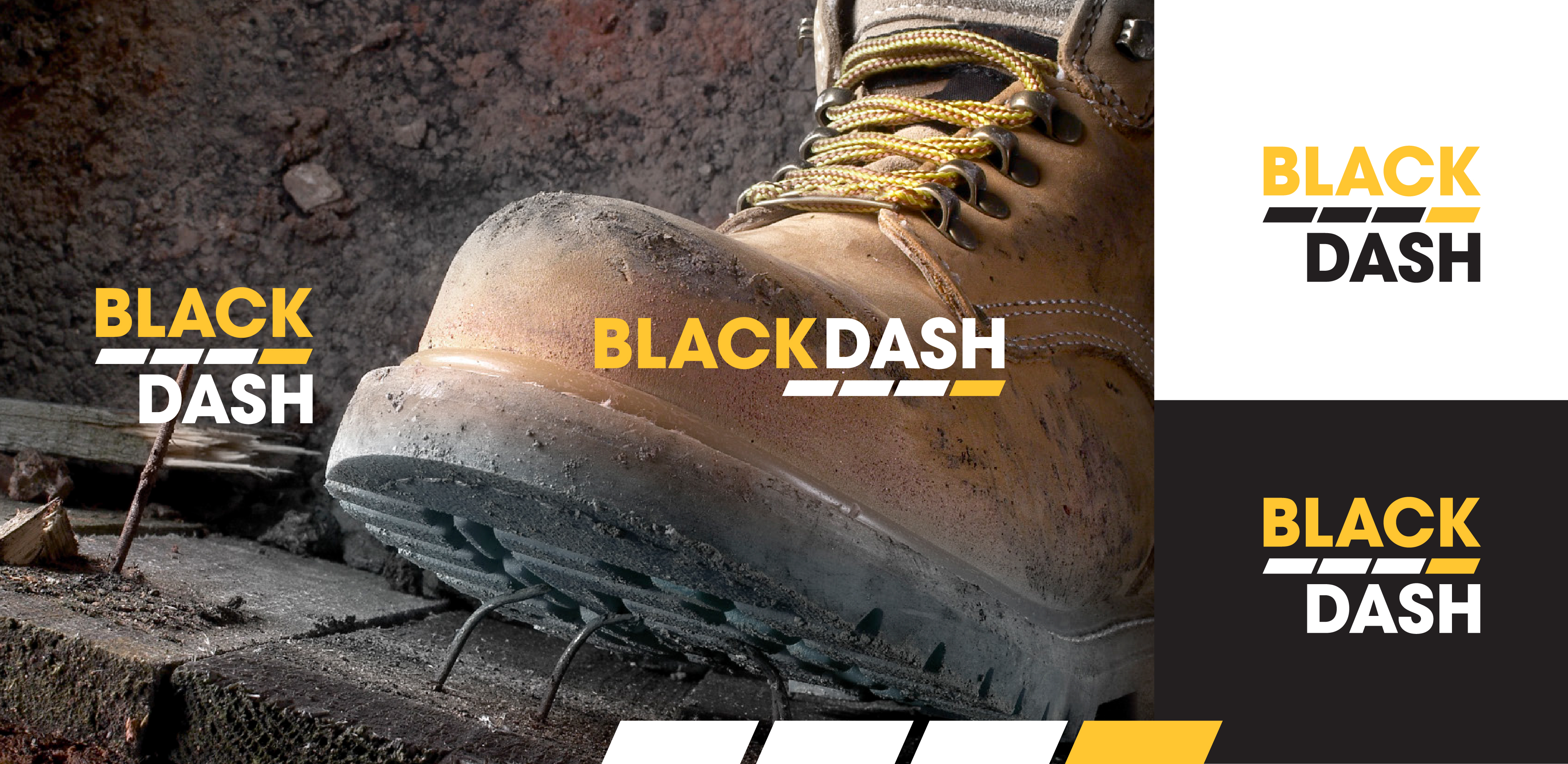
I designed the logo to feel strong, simple, and matter-of-fact as Black Dash works in Workplace Health and Safety for the mining industry. The uppercase text suggests strength and confidence.
The black dashes in the icon refer to the name ‘Black Dash’, but they also resemble safety tape that would be obvious to customers in the mining industry.
The dash has forward motion with the black dashes pushing the yellow dash, which represent their customers being propelled by Black Dash to improve efficiency and capability. The logo is right-aligned to suggest moving forward.
The combination of black and yellow is eye-catching and widely used in Work Health Safety.