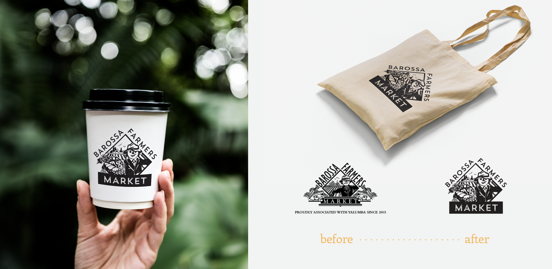
In 2017, I had the pleasure of working with the Barossa Farmers Market to refresh their brand. The aim was to retain most of the current logo elements while infusing a touch of modernity into the new design.
To simplify the icon, I created a re-imagined illustration by removing the produce from the sides and making the logo more compact so that it was easier to use in different applications and at different sizes.
The new illustration still honours the original drawing, by including the farm house and scarecrow. I also kept the original positioning of text around the icon so that the design remained recognisable to their existing customers. I added a basket of produce to show that it is a produce market and bring produce within the icon.
A modern but rustic font was chosen to allude to handmade and grown nature of produce.