The Proud family first settled on the banks of the Murray River during the final years of WW1, moving to Loxton in the 1920s they commissioned the Sherwood Irrigation Area’s steam driven pumps. Today, Sherwood Estates is a Collaborative Farming Venture, operated and managed by third and fourth generations of the Proud family.
In creating the new brand we wanted to acknowledge the history of the estate whilst looking to the future as they developed and showcase best practice in viticulture and sustainability.
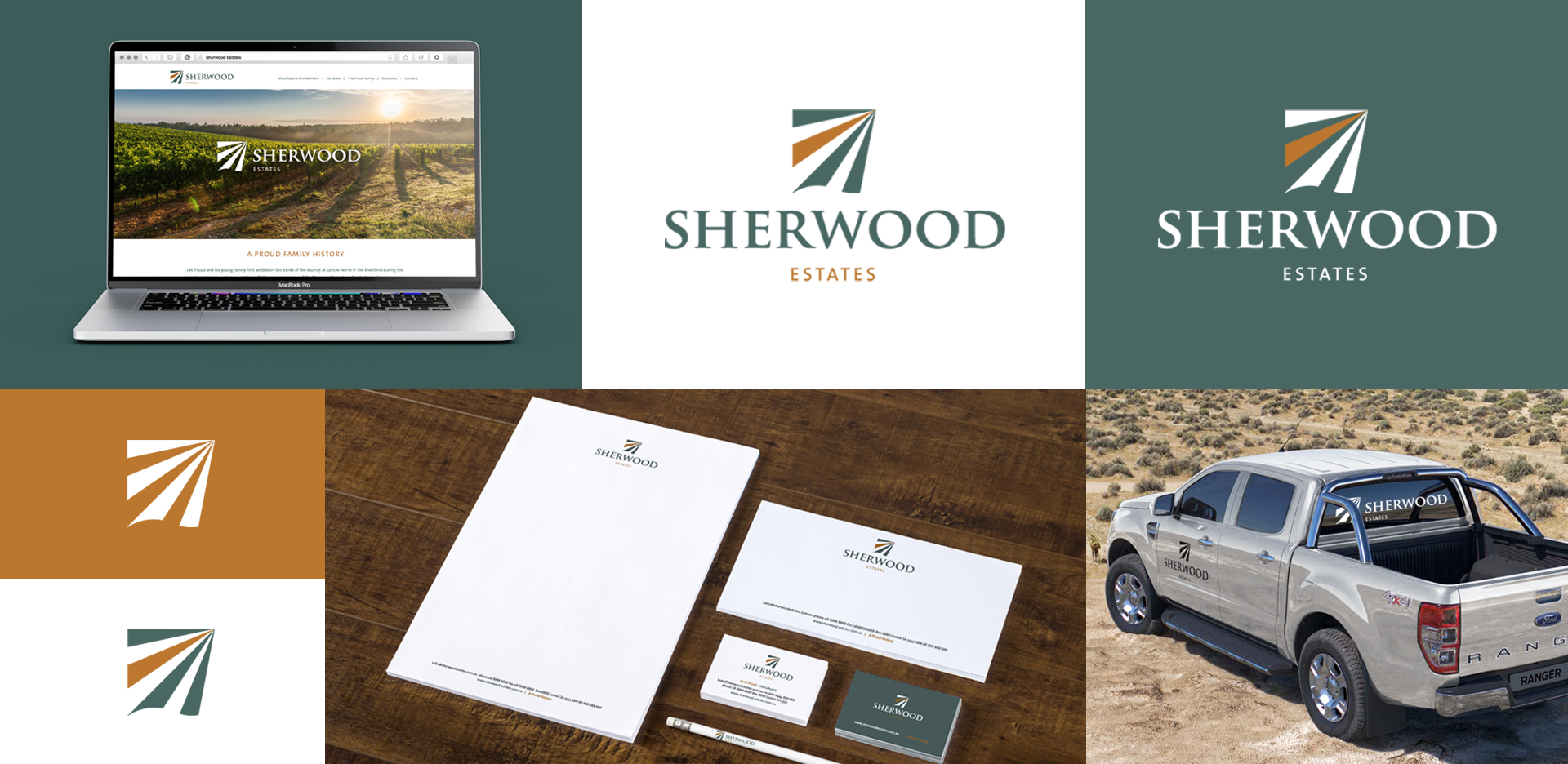
The vineyard rows of the icon from a vanishing point, suggesting sustainability into the future; a key value of the Sherwood estate. The edges of the icon are square and sharp, reflecting the precision and astuteness of Sherwood amongst its riverland competitors and the forward motion of the icon points toward the future, innovation, and forward thinking.
The wave at the base of the icon alludes to the flowing Murray River that underpins Sherwood Estates. It also resembles one side of an open book, suggesting that there is proud history and story to Sherwood Estates.
The colours reflect the colours of the Riverland – the silvery green of foliage and the golden orange of the earth.